By Teddy Hunt
A logo is one of the most powerful weapons you have when it comes to annihilating your competition and standing alone as the most powerful company in your industry. Conversely, having a poorly designed logo is the equivalent to shooting yourself in the foot. When creating your company’s logo, make sure that it’s something that positively stands out and attracts potential customers and clients in the blink of an eye.Â
With that said, here are seven popular logo design trends that you should consider using if you haven’t already.Â
1. Purposeful Negative Space
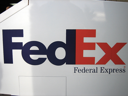
Image via Flickr by adactio
Negative space, also known as white space, is essentially space that doesn’t include content (it doesn’t have to be white — it can be any color as long as it doesn’t have content). The purpose of negative spacing in logo design is to draw attention to a specific object without having their eyes wander all over the place. Combining design and negative space in a clever way is also effective. The FedEx logo is one of the best when it comes to using clever design and negative space (take a look between the “E” and “x”).Â
2. Dynamic Letterpress Techniques
Â
This is one of the newer techniques used by logo designers, adding depth to objects within the design. The technique essentially elaborates on original letterpress design, providing a new look that’s appealing to the eye. Letterpress was originally done in print, but graphic designers are now using computers to recreate their own unique styles of this technique. If you want to follow the newest trend out there, this is the one.Â
3. Line Art
Line art is an image that has distinct straight and curved lines placed against a plain background, without changes in shade or hue to represent either two or three-dimensional objects. Graphics designers usually use a pen tool in Illustrator to create a clean and thin-shaped logo using this type of art. Here are some great examples of line art used in logos.Â
4. Gradient Mesh Adds Depth
It’s said that gradient mesh is one of the most powerful tools in a graphic designer’s Illustrator toolbox, but it isn’t easy to master the skill of using it. One of the biggest benefits of being able to use this tool effectively is that it helps you provide depth to a logo in ways that other tools can’t, enabling your to recreate shadows and highlights that give your logo a unique perspective. Here’s a beginner’s tutorial on how to use the gradient mesh tool.
5. Contrast With Dual Impact
Simply put, graphic designers use the dual impact technique to create a double impression in a logo. If you look at this dual impact logo example, you’ll notice an outline of a buck within an elephant. This dual impact design provides a clean and clever logo that’s perfect for a wildlife zoo.Â
6. Geometric Abstract Polygon Styles
One of the most popular and common technique in logo design in 2014 involve geometric abstract polygon styles. Although the name of the technique sounds complicated, it simply refers to making different abstract shapes stand out within one or multiple areas of the logo. If you’ll still not picturing clearly in your head, take a look at this logo example that highlights the concept and technique.Â
7. The Overlap TechniqueÂ
The overlap technique in logo design has been around for ages, but it’s especially becoming popular this year. Graphic designers using this technique allow different elements of a logo to overlap one another, making it possible to add depth to it in a way that makes it interesting but not distracting. eBay’s logo is a great example of overlapping typography to create a unique look, making it a logo design that’s effective.Â
It’s more important than ever to have a logo that stands out and says that your company matters in the world. Applying the right technique and design can make all the difference.Â
What new logo designs have you noticed that are stellar? Leave a comment below and let us know.Â

