What a Few Tweaks Can Do

I met Carole Hicks on Twitter. Then she asked a question via email and, before I replied, I made her an offer. I said I have this feature called, Above the Fold, I’d like to bring back to my blog. Would you be game for consultation? She was most agreeable. Thus starts the saga of tweaking her blog with the fabulous title —
Everything in Order [dot] com
But the fabulous title was outshouted by some noisy color …
So we got to work together. Here’s how the Above the Fold Tweak Process works
- I make a “before” screenshot.
- We talk through some changes for readability.
- The blogger makes the changes. (In this case, Carole took notes for her developer.)
- We talk while the tweaks are in process. (She passed them on.)
- I take an “after” screenshot and share the results in a post.
Tweaking Everything in Order
The blog: Everything n Order . com
Everything in Order, creative problem-solving…beautiful ideas.
URL: : http://www.everythingnorder.com
Blogger: Carole Hicks
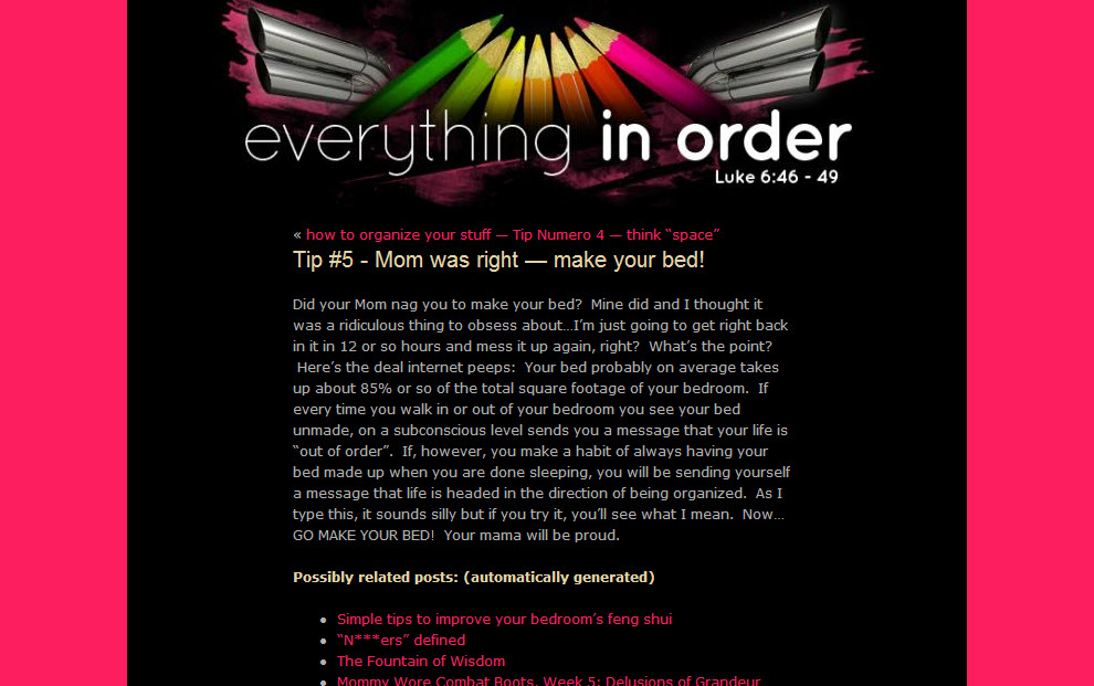
Before
This is EverythingnOrder.com before we started.
Three Tweaks that We Agreed Upon
In this series, we’ll concentrate only three important tweaks for each blog that is featured. On Carole’s blog, those three tweaks were these.
- The backgrounds were overpowering — the coral wrap and the coral type were too vibrant and vibrating.
- The sidebar needed focus and less text / and disappeared on the post page. (Sorry I missed the sidebar in the screen shot.)
- A search box and ways to subscribe were missing.
Carole and I discussed how the true black background played into the bright shade of the coral outer wrap to make it almost vibrate. I suggested another shade of color with a touch more black in the coral and a black background that was a little more charcoal. blink test, the feed button wins. We decided that it would be a much stronger presentation if the title got that first attention. Folks would remember where they were and where they wanted to return.
We talked about the tag cloud and other sidebar information. I mentioned that the large tags seemed to be saying that’s all or mostly all she talked about — was that the first impression she wanted to be giving? Carole decided that might not be her whole story.
When choosing text the type size needs to match the line length. If they don’t match, the eye has trouble doing the “return sweep” to the next line correctly. As often happens, the line was too long for the size of the type in the body text. We shortened the main body copy block and increased the type size.
We talked about reasons that a search box and subscription options were important.
We made other changes. Can you see them?
For the results, turn the page now. [Read more…]
