By Shaun Chatman
Your newsletter is an important way to get relevant information across to your customer base, clients, or readers. But all of these people will be viewing it on different devices. Use these tips to simplify your newsletter’s content and formatting, to enhance readability and keep your content user-friendly.
Format in a Single Column
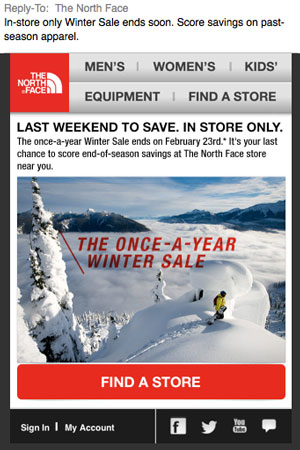
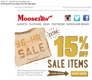
You may be tempted to use fancy design work in your newsletter, but the best way to go is a simple format that puts all your information into a single column. Go for a column 500 to 600 pixels wide, and be sure to take into account special formatting for mobile devices. You won’t be able to keep formatting completely uniform over all devices, but you can take many steps to ensure that it doesn’t fall apart and become unreadable on certain devices. Simplicity is your best friend in these instances. Choose a few design elements (like text formatting and social media linking) that make the content easier to consume and then stick with those and ignore the impulse to go over the top.
Break Content into Headings
Your newsletter probably contains multiple points you want to communicate to your readers. Rather than writing it in the style of a letter with each paragraph flowing into the next, create a new heading every time you come to a new newsletter item. Make that heading obvious and separated from the rest of the content. By doing this, readers who are skimming through on a device with a smaller screen will know where to stop and start reading.
Use Images Sparingly
One or two interesting images will enhance the content of your newsletter, but overloading your newsletter with images is a surefire way to make it more difficult to read on multiple devices. Images, by default, require different formatting than text does, so no matter how careful you are, the more formatting you add to your newsletter, the more likely it is something will go wrong. Also, images take longer to load, especially on hand held devices like phones or tablets that may be connected to a 4G network rather than wi-fi.
Streamline Your Content
While skimming through paragraphs of content may be easy on a laptop screen, if someone is reading from his or her phone, it takes longer to scroll through a lot of text. Even with headings, keep your newsletter’s content relevant and brief. If you’re wondering about types of content apt for your newsletter, go for content that your readers can consume in bite-sized chunks. Tips and tricks for your customers, a short letter from the CEO of your company, or lists of significant blog posts or news articles are great places to start.
Remember, it’s not just about formatting. Good content also keeps your newsletter fresh and interesting for your readers. Each newsletter will look different, but by keeping it simple and following these tips, you’ll be well on your way to creating a newsletter that works on as many devices as possible.


